Mixpanel product refresh
2017
Founded in 2010, Mixpanel had built a reputation as an innovative and powerful analytics tool that was also beautiful. However, as the product was built up piece by piece over the years, it no longer felt modern and cohesive, and new features were not meeting metrics expectations.
As a result of my user-focus and strategy, the first phase of the refresh we launched increased engagement in most of our reports (ranging from 9% to 300%!) and sported a cleaner and more up to date visual style to more closely match our marketing properties.
Getting started
The year before I joined the team, the CEO brought on a freelance designer to redesign the product, but the work had stalled after his contract ended. Everyone wanted to find a way to launch a redesign, but getting a project like this off the ground takes a plan.
When I joined 6 months later, one member of the team was slowly taking the redesign proposal and applying it to other flows within the product. I was asked to direct his progress.
It was clear to me from the beginning that in order to move forward on this project, we required clear and measurable goals to help direct us. Product redesigns are notoriously difficult and costly projects to take on, and the way the current project was framed it likely would have taken over two years to design and implement. That’s a long time to work on something that far-reaching without customer input!
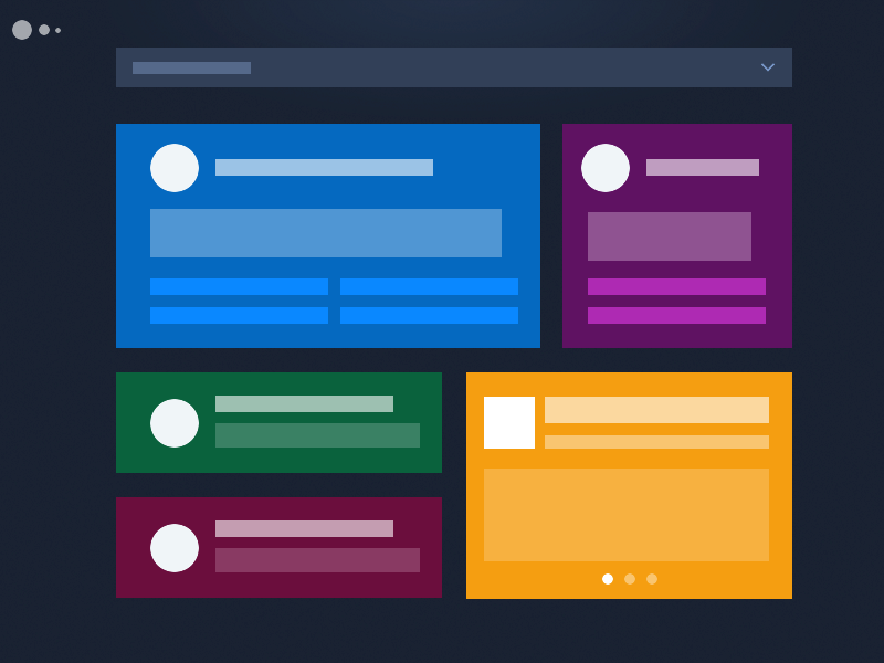
An earlier version of Mixpanel, compared with the proposed redesign done by a freelance designer before I joined the team.
As my first step, I needed to understand the problem we were looking to solve. I spoke with stakeholders and partners in the customer-facing teams and discovered three separate problems.
Visual update
Our reputation as an innovative company was closely tied to our visual style, but that style hadn’t been updated in years. The market had moved past us and we now looked extremely dated. Without this defining edge in a very crowded space, would couldn’t compete with the same brand strategy we had been using.
Growing UI complexity
Each feature had been designed and built fairly separately, so there was little consistency in interaction and report architecture. The benefit was that the team wasn’t beholden to old patterns from years earlier, but the cost overall was now too high. New features were always designed from the ground-up, which expanded both design and engineering time; global updates were difficult to the point of being impossible; and, most importantly, our product was more complex than necessary. If our Support team spent over two weeks learning the product because each feature worked slightly differently, imagine what our customers went through!
Feature growth
As the team continued to build new reports and features, it was becoming difficult to find a clear entry point. In fact, we had launched several reports based on customer requests but their usage metrics were lower than we had hoped. When we reached out to customers about their usage, the most common response was that they had forgotten the report existed. This indicated that the primary issue wasn’t the report itself, but the discoverability of the report within the UI.
My approach
Now that I had a better understanding of what the redesign was expected to accomplish, I set my own guiding policies for running a project of this scale.
Guiding principles
- Get user feedback through the process
- This may seem obvious, but formal feedback and usability sessions were not yet a normal occurrence in the company.
- Set priorities and boundaries
- Large projects can too easily grow in scope without a clear way to say no. Being explicit about the boundaries of your project from the beginning and sticking to them can help prevent scope creep (not all of course, but at least some).
- Reduce dependencies
- Dependencies can certainly slow a project down, but dependencies in UI can muddy results and make it difficult to measure outcomes.
With these as principles in mind, it became clear that the proposed redesign would need some work to ensure it was successful. So we set it side, and I broke up the project into three distinct and launchable stages, which mirrored the problems uncovered during the discovery phase.
Phase 1
Extensibility
Create space for features over the next 2 years, while ensuring customers can easily find the reports they are looking for.
Phase 2
Consistency
Improve UX by reusing patterns and components across the entire product, thus reducing surface area.
Phase 3
Brand refresh
Using the system build in phase two, update the visual design to be more inline with a dynamic and first-class brand.
The three phases of work. These allowed us to focus, learn, and provide value to our customers more quickly.
Focus on extensibility
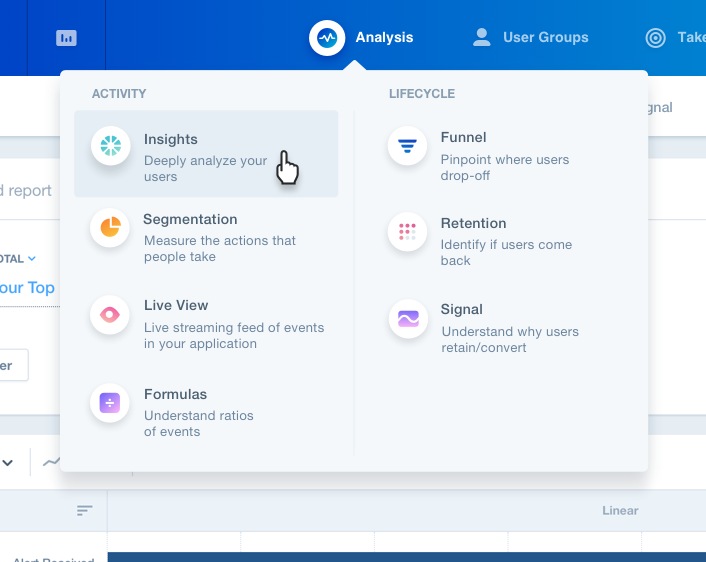
With a phased approach to the launch, we were able to focus on a much smaller problem set – the top level navigation in the product.
Research & framing
Our current design was a long list – it was hard to scan and used an internal data model our customers didn’t think about. We knew we needed a way to break them into categories.
To give us a seed for these categories, we ran a card-sorting test with all our customer-facing employees. This provided us with some insight into how our Sales, Customer Success, and Support teams talk about our product to our customer
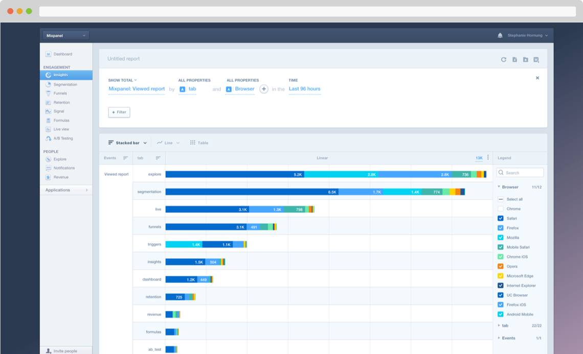
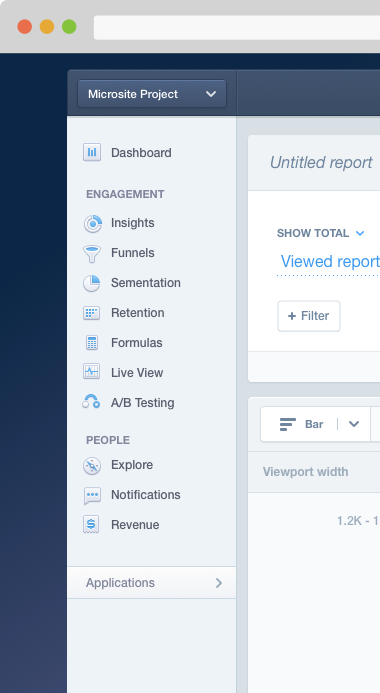
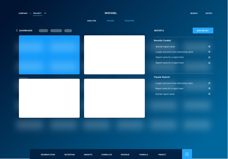
Sidebar navigation to the reports available in Mixpanel
Exploration
Even though this was a focused initiative, one small enough for a single designer to tackle, its potential impact was quite large. So it was important to ensure that the entire team was involved from the beginning. We spent two days off-site exploring different possible designs.
A few of concepts created by the team during our offsite
Testing & iteration
Using the data from our card-sorting exercise and the ideas from the team, we then developed a few options and validated the categories with our customers. The testing process took several forms – each aimed at learning different things from our customers.
- Category validation
- Before committing to the categories we had, we put together some wireframes and did a series of timed usability tests with customers.
- Surveys
- We ran 11 different surveys in-product to help us narrow in on labels that were proving more difficult.
- Prototypes
- Once we had a high-fidelity design, we tested a few different click-throughs to help us answer some questions and get some more qualitative feedback
Test phases
Launch & learn
Even though our usability tests indicated that our users were easily able to find the important reports in the new design, we still wanted to mitigate the impact of the change by staging the launch and tracking engagement.
Given that Mixpanel is a product that people rely on to do their work, it was important that we tested the waters carefully. Regardless of the quality of a change in the long run, the emotional impact of a change being forced on customers can be very costly to your reputation and relationships. From a business perspective, it was also important for us to have clear metrics to ensure we weren’t hurting usage.
With this in mind, I proposed a rolling launch plan and then worked with the PM to refine it. We started by launching to a small set of our users with the ability to opt-out, so we could gather preference metrics and feedback. We then followed up with an A/B test to measure engagement in the new design vs. the control.
Launched solution
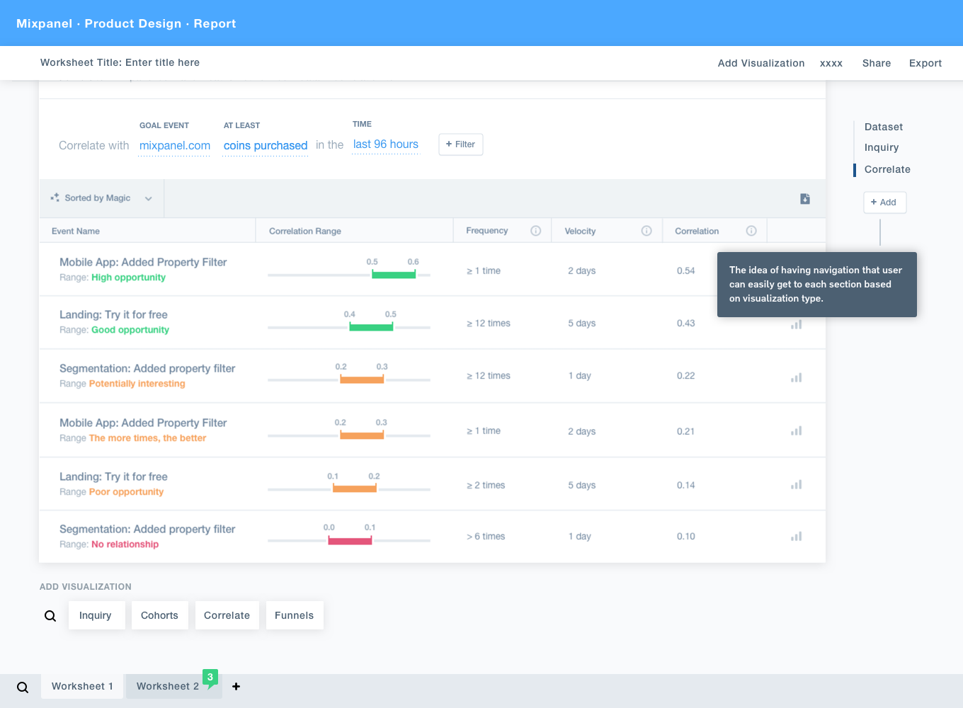
The final design maintained the category concept we had in the beginning. However, since the extra level can slow down navigation between reports, I prioritized finding ways to speed up the perceived performance of the product. By combining hover dropdowns and more responsive loading indicators we were able to reduce the amount of clicking and waiting with the new design.
Another key aspect of the new design was the inclusion of descriptions for each of the reports. Through discussions with stakeholders and customers, we knew that the report names weren’t always meaningful enough to encourage exploration. While adding more text can add visual complexity and not always encourage users to read the content, our usability tests indicated that the context made the product more relatable to our customers. By adding explanations and indicating similarity between reports, we were able to create a mental model of our offerings to our customers that didn’t already have one.
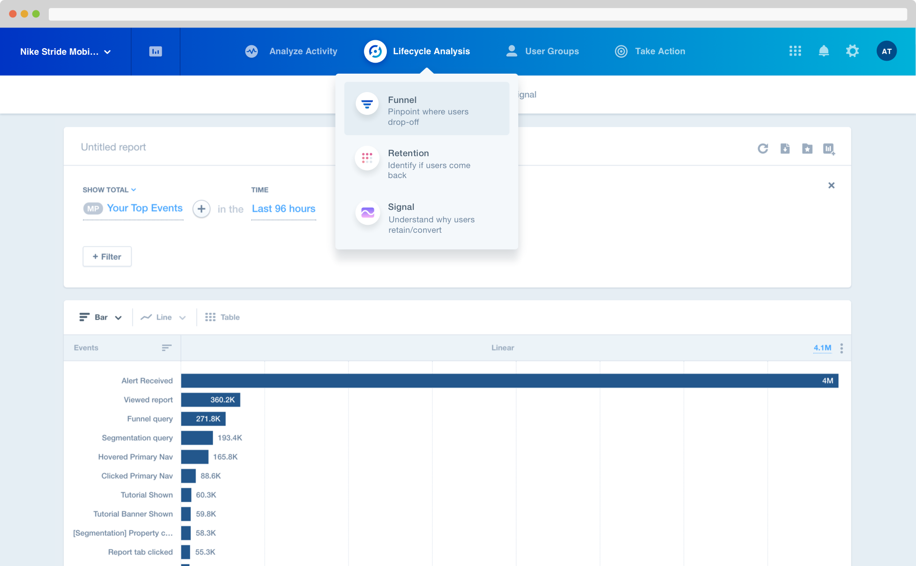
The updated navigation and design we launched as an opt-out and A/B test
After launching our first A/B test, we found that some of our reports were not performing as well with new users. These reports were all in a single category, the one we had the least confidence in after our pre-launch testing. So we iterated and chose to combine two categories at the top level but keep the separation within the menu.
After running the A/B test, we combined two categories to improve the engagement on some of the reports
Results
70%
liked it better
15-40%
for new reports
9-15%
for already popular reports
Metrics
On the qualitative side, we received a lot of positive emotional reaction. More than 70% said they liked the new version better. Our visual style was cleaned-up and modernized by making small visual changes, and improving consistency in color, type, and spacing.
In terms of engagement metrics, nearly all of our reports rose in daily active users. The reports we recently launched in response to customer requests, Dashboards and Signal, had a 15% and 40% increase respectively. Given that customers had previously said that their lower usage was due to inertia (they forgot the reports were there), the bump in usage indicates that discovery had been very much improved.
It wasn’t just our newer, specialized reports that increased in usage. Our core reports, which were already popular, also received a lift. Insights, our second most popular report increased 15% and after we combined categories, Funnels increased 9%, and Retention increased 10%.
Internal impact
The metrics outcomes of this project were highly successful by any measure, but the impact I am most proud of is the change in the way products were developed and released at Mixpanel. In the past, launches were stressful. They were large releases with a lot of pressure to get everything right the first time.
By structuring the project around user feedback and ensuring we scheduled time to react to test results, the attitude on the team was completely different. We created room for learning and experimentation and increased confidence, all while mitigating the impact on our customers.