Asana design language
2014-15
A major part of the New Asana rebrand in 2015 was the development of a new design language. Externally, we aimed to cohesively and consistently express our brand to our customers across all our touch points. Internally, we were looking to improve efficiency and empower the design team and our partners.
While the design system will never be complete, documenting the language and having it available to the greater team had a further reaching impact than we had expected. Our feedback cycles were improved, iteration became faster, and the nature of our collaboration with engineering changed for the better.
Defining the problem
Before setting out on any new projects, I always try to understand the problem I'm trying to solve in order to focus the work on the highest leveraged pieces. For each of the problems we identified, a subsequent goal for the system was agreed upon.
Designing the product was more difficult, time-consuming, and often not as good as we knew it could be.
We all agreed that a consistent and cohesive product was important. And as a result, we put a lot of effort into maintaining consistency as we grew. But without a broader understanding of the design language and what we were trying to accomplish, our design became stale, boring, and un-innovative.
The complexity of the UI and number of variations made it difficult to pick out the system
Designers felt constrained by rules that were unclear, unsure about which parts of the system to use and how. We were spending more time than we wanted on discussions and reviews that should have been simple. And instead of spending time on new problems, we were often finding ourselves revisiting or questioning decisions that had already been made. Not because we thought they needed reworking, but because we just didn’t know what had been done before.
Like most endeavors, having an agreed upon and understood set of principles and goals can help guide decisions and resolve disagreements more quickly. And while it may not seem intuitive, having a good sense of rules can empower designers to confidently and intentionally break them. Without a deep understanding of where we were, we weren’t able to take the time to move the system forward in a clear direction.
Goal #1
A good design system should empower designers to do their best work, not constrain them with seemingly arbitrary rules.
Implementation and iteration wasn’t simple
Even though we put effort into maintaining consistency in the web product, most of it was just on the surface. In service of speed and getting the product to market, many of the core features of the product were implemented as one-offs.
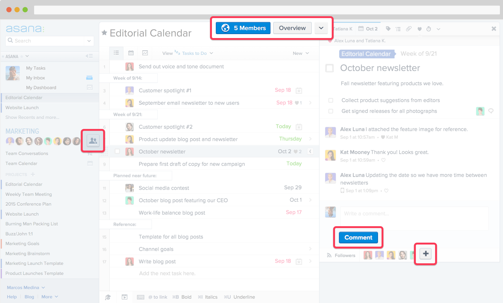
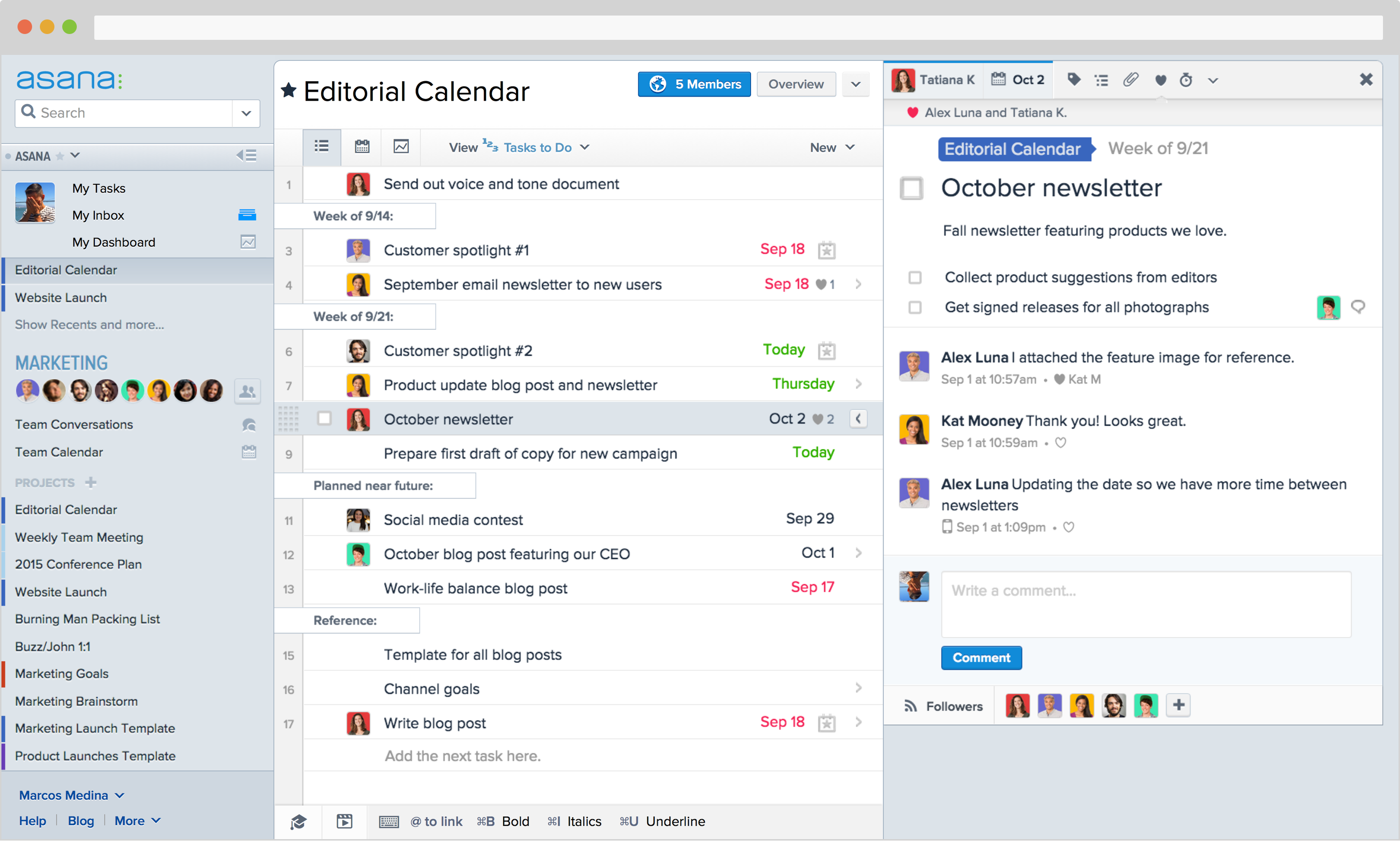
As an example, each of these buttons was implemented slightly differently.
Even more importantly, since the design system wasn’t clear, the components built by engineers didn’t usually match up with the design system. This meant that not only was re-use not easy, the engineering team didn’t feel able to make simple design decisions, like the color or placement of a button, on their own. Without a clear foundation a design system provides, engineers were often focused on the implementation rather than the design, unable to act as true collaboration partners by providing feedback and ideas.
Goal #2
A good design system should foster collaboration and empower design partners to make decisions that are in-line with the brand.
Consistency across platforms was even more complicated
Because we started our design with the web product, there wasn’t a system outside of that. We had a color scheme and type, but without a broader definition of the brand, it was completely unclear how implementation in one platform could translate to another. But again, because we were in our early stages, spending the time to take a step back and figure that out didn’t feel like the right use of resources.
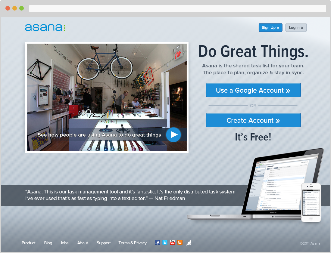
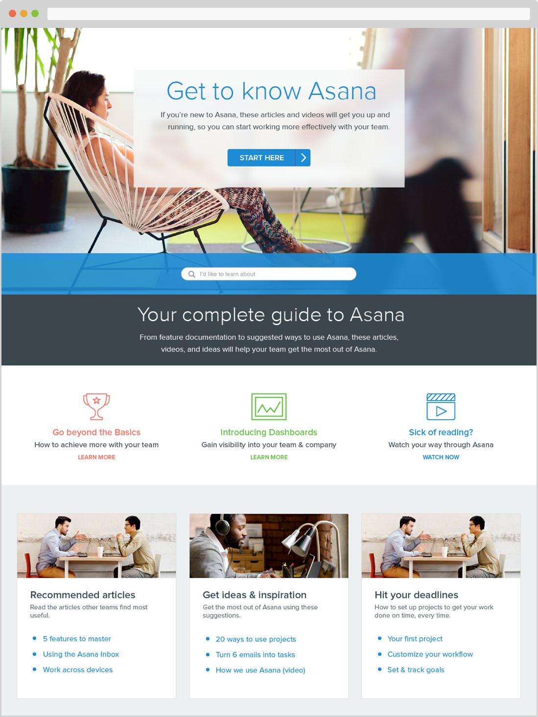
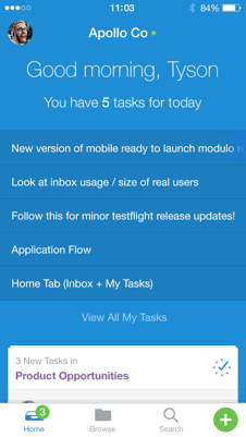
An early marketing site, help center, and iOS apps. The latter are in an interim visual style.
It was feasible to use some elements from the web product in marketing, for example, but in most cases it felt awkward because the use-cases were different. We knew that on different platforms these styles could actually be different if at a higher-level they complimented each other. But without that set of guidelines, it wasn’t clear where it made the most sense to diverge and still feel like we were conveying the same brand.
Overall, it came down to the fact that we didn’t know who we were. Externally, this resulted in a distinct lack of personality and little to no differentiation from competitors.
Goal #3
A good design system should be a clear implementation of your brand attributes, allow you to suffuse personality throughout the experience.
Developing the design language
The first essential step in creating a design language is to understand the brand. At Asana, we chose to go deep into redeveloping our brand (which you can read more about here) but a rework of your brand isn’t necessary to build a system, only an understanding of it.
Creating a real and workable implementation of the brand is like turning words into action. Picking things like typeface and color is just the first step. Determining how to use these tools in your design work is where you refine those initial brand elements and truly bring your product to life.
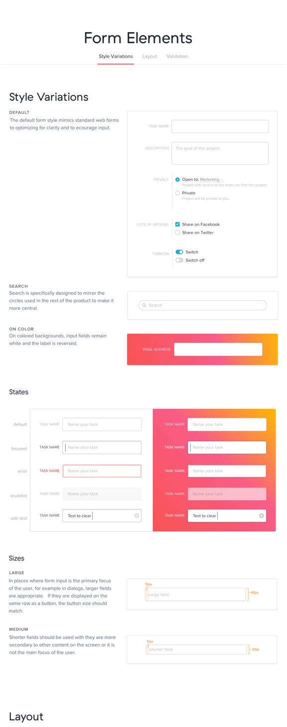
We started with the basics
Concurrent with the process of defining our brand, I began to work on setting out a framework for defining the overall look and feel. While we knew that some parts of it would change as our brand became more solid, this gave us a strong base to start with.
We looked at the very basics -- like how and if to use depth; the amount of whitespace; the primary color feeling of on a screen; base text size; and what interactions should feel like. And then we used this framework to help us define the most basic components that would be used across screens and platforms.
The initial framework also helped us recognize where these elements would vary across use-cases and where they would not. For example, the base type size on Marketing needed to be larger, but what interactions looked like could be shared. This allowed us to design elements like basic body copy, buttons, and form fields in a way that worked both in the product and on marketing sites that were different but still felt related to each other.
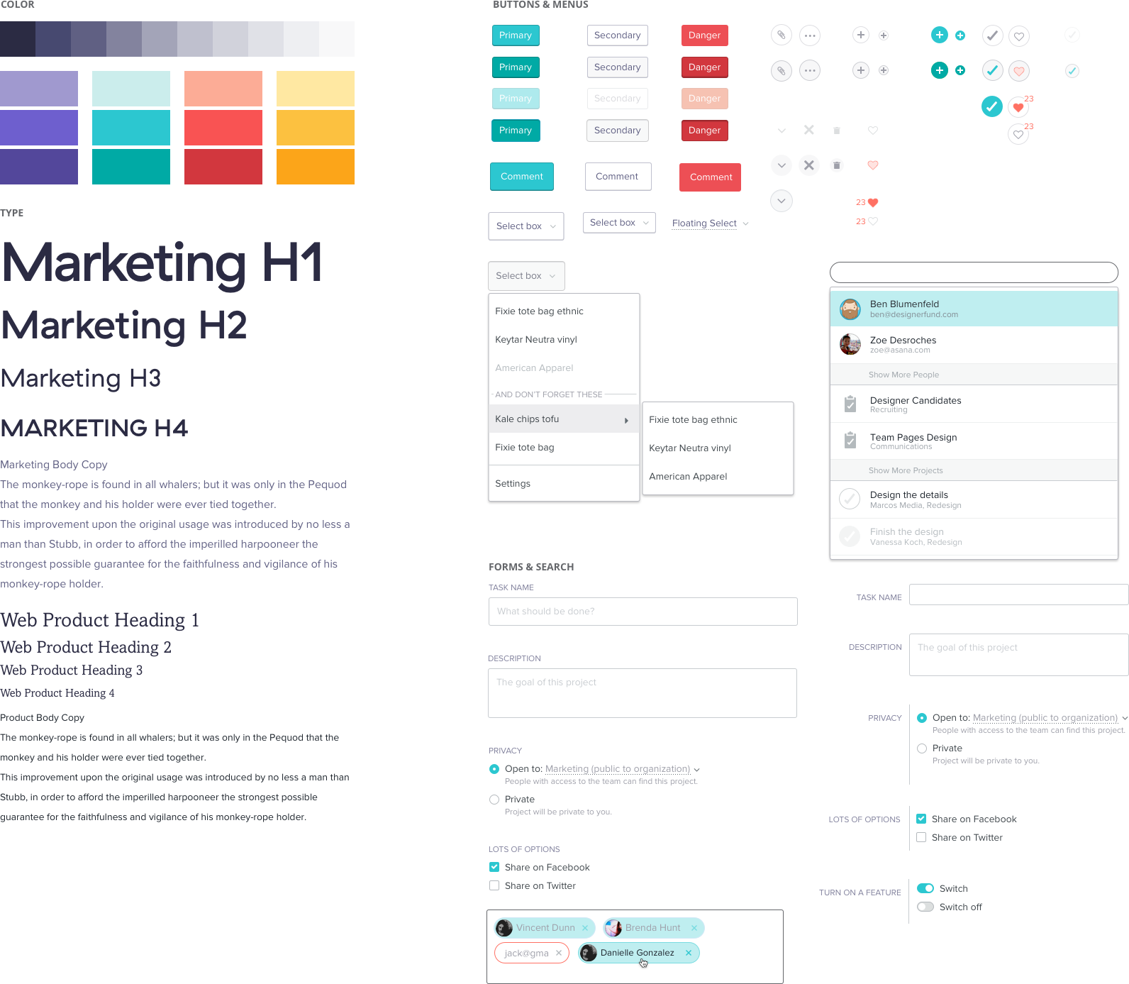
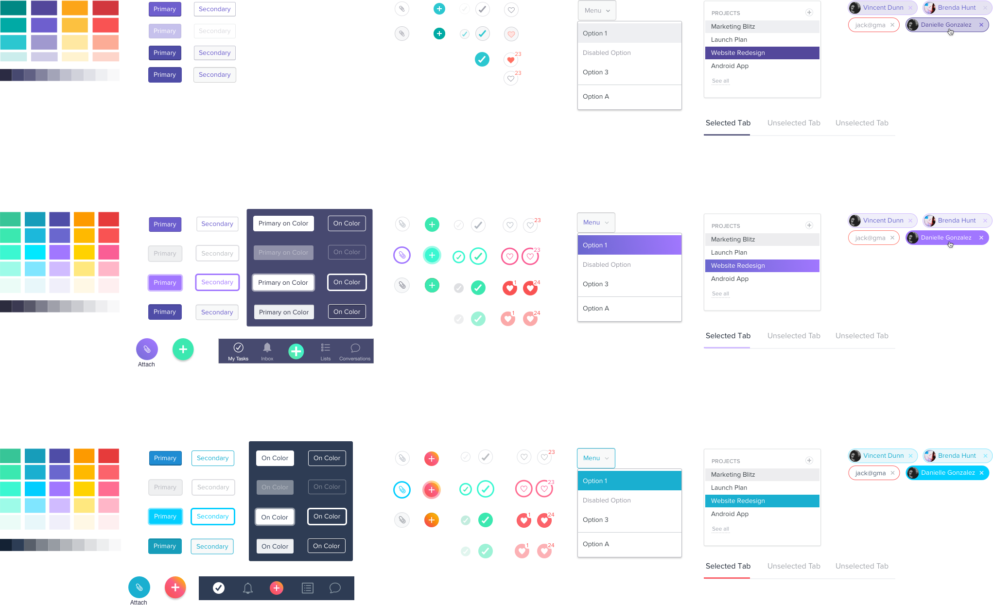
Early pass at some of the basic elements of the design system.
Testing in key flows informed us early and often
Once we had some basic elements designed, it was important to see how they worked in practice by testing them in key user flows we had wireframed earlier. This helped us know when we were going in the wrong direction, define variations, and gave an opportunity to define elements we had missed.
This was also a great way to involve the entire design team in pushing the boundaries of the system, finding holes and internalizing the language. As the lead in the development of the system, it was my role to work with each of these designers through implementation and to find where we needed to make changes.
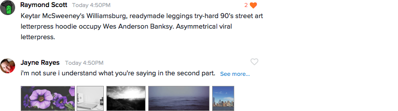
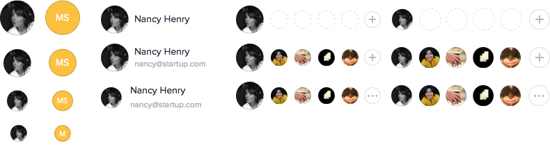
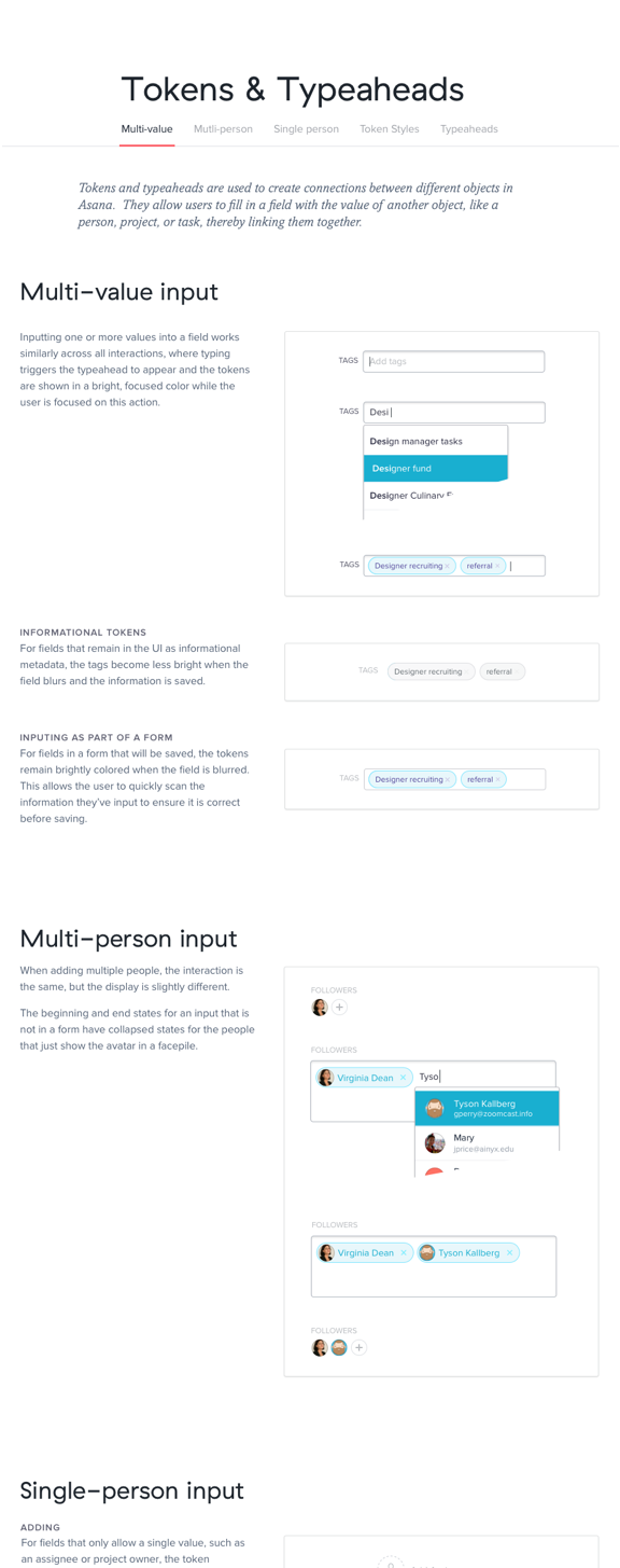
For example, a robust system for avatars and comment blocks were developed to account for all the different ways that can appear and be interacted with.
Comparing across platform kept us cohesive
One of the main problems we had identified early on was that our brand wasn’t cohesive across platforms, so it was essential for us to make sure that we continued to revisit how we were interpreting the brand in all the use cases and work to bring the patterns together when they diverged.
The most important thing we learned here is how important it is to be open to changing core elements if it will help strengthen the connection between the platforms and the brand. It was during these exercises that we made the most changes to the core of the system.
The largest change to our visual language came out of the discovery that our brand motif, which was based on the concept of "daily flow", wasn't working. Implementing it was proving difficult across use cases and platforms, and we realized that it wasn’t doing its job of communicating who we wanted to be.
After a few weeks of trying to make it work — a small set of the team got into a room to rethink our motif and came out with a new concept, one of "clarity + energy". (You can read more about that process here)
Iterations on how color was used in the components over time. The last change was made only a few weeks before launch.
The new style included a new color palette, but more importantly a new and clearer sense of how color should be used. Normally, such a large change midway through a project could have felt like we were starting over. But since we had a framework already in place, we knew the changes we made were more focused and informed.
In fact, our continual comparisons and collaboration brought about several more changes, up to within a few weeks of launch. With each of these iterations, the brand became more opinionated, color and component usage became clearer, and the cohesiveness got stronger.
Getting it into code
While the development of the system was focused mostly on the Design team, a project like this can't be successful without strong partnerships with engineers. Through the process, I had discussions and small meetings with every engineer who would be working on the front-end, to discuss what we were doing and get feedback. I created a few training sessions on how to use Sketch, so they could have direct access to our work, and helped them set variables to certain tokenizable values – like padding, color, and font size.
One of the key outcomes of these meetings was recognition that design can be abstracted in a way that actually matches a typical engineering mindset, thus removing some of the 'magic' of design. Giving the explicit permission to an engineering to question something like the color choice (Did you mean this color? It's not in our palette) was surprisingly empowering and barrier-breaking.
Results
A clear design system was something we all wanted, but until this effort we weren't able to devote the time to doing it well. It was surprising that even though we all believed in the benefits, none of us expected the impact to be so immediate.
By documenting the patterns and having the entire team testing and iterating on them, we were not only all able to internalize the brand, we also changed the way we worked together. Feedback shifted away from personal preference and details and became more about flow and experience. We also found that since we all felt ownership over the design language, our conversations could be about the goals set out by our brand and where our boundaries are.
We also found that by having patterns to follow, we didn't have to discuss or spend a lot of time on designs that were fairly straight forward. Some work was able to be done in a matter of hours instead of days. It was clear how it should look and work based on the components in use in the feature.
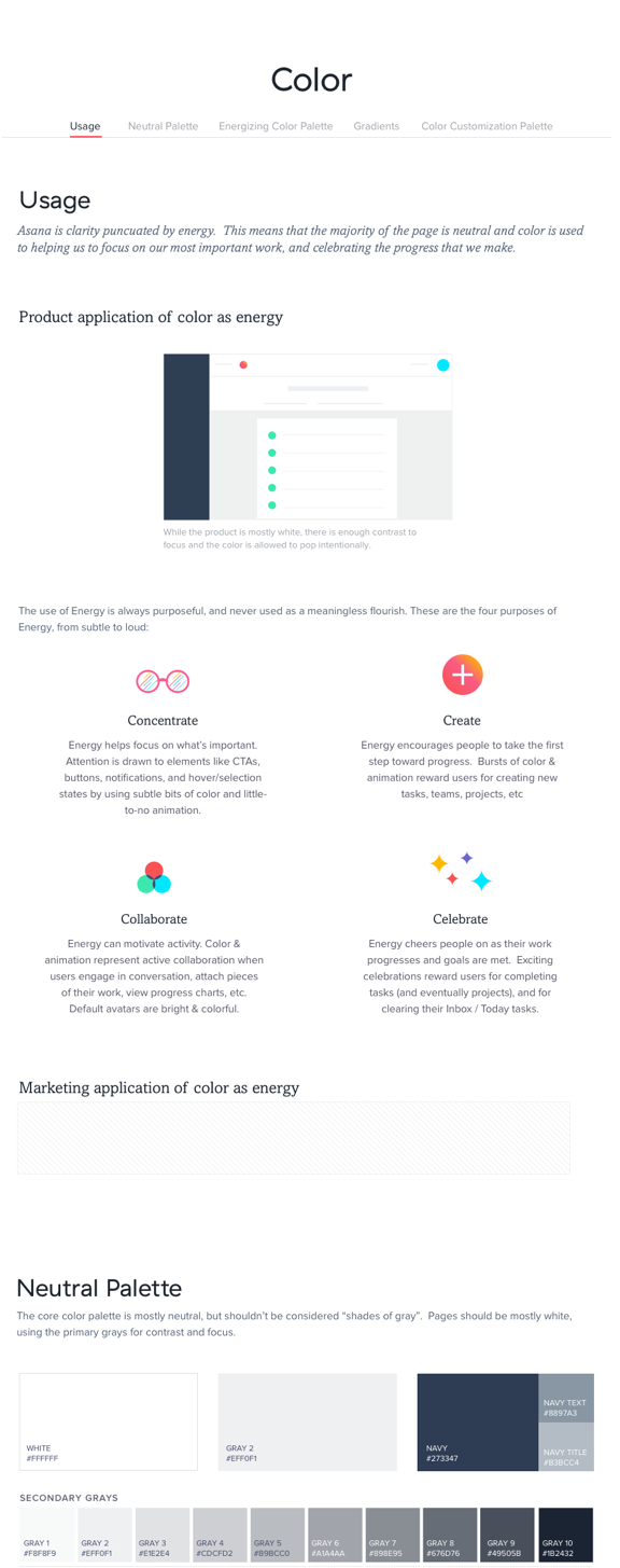
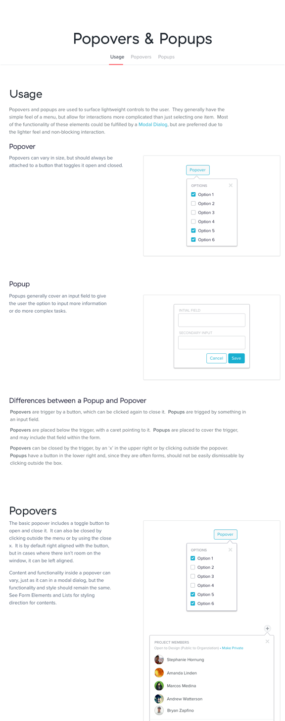
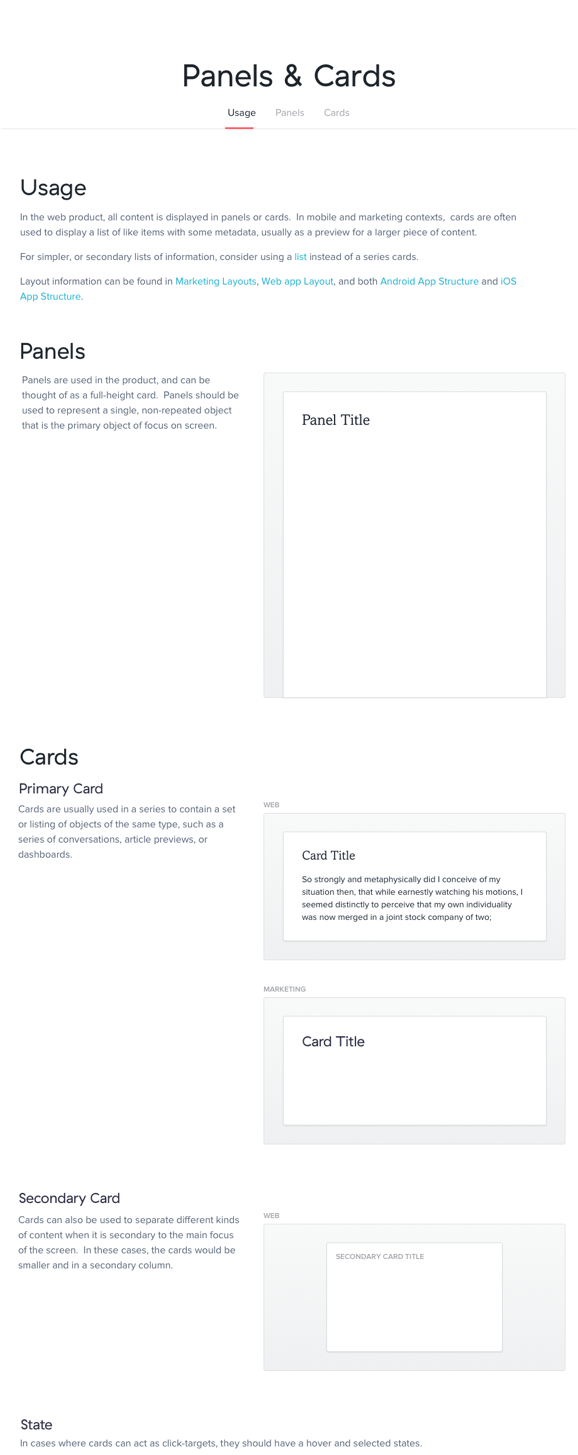
Just a few of the pages that were part of the design language documentation.
The biggest impact was how it changed the relationship between design and engineering. We believed the style guide needed to be more fully featured for it to be useful to engineers, so we didn't focus on this problem in the first iteration. However, by just making the documentation available to engineers we not only eliminated the need for redlines and mock-ups for every screen, we created a shared language with which we could communicate. By providing this language, the perspective of the engineers shifted away from implementation and towards what the design was trying to achieve.
The design language not only allowed us to create a cohesive brand, it empowered designers and design partners to collaborate at a higher level. And this more than anything else has the largest potential to positively impact the way we work and the product we build.